Ultimate checklist of 50 (proven and effective) ways to improve a website.
Create your marketing strategy to rank high on Google.
Have a successful website that works for your goals.
50 Ways to Improve a Website
(Don’t try to implement all at once!)
This article is primarily for website owners unsatisfied with the website traffic. But, if you consider hiring someone to build a website for you, you’ll save a lot of money, time, and nerves if you dig into our list.
List of proven tactics and ways to improve a website
- Increase speed of ALL pages
- Make a website mobile friendly
- Check if you have an SSL certificate (if not, immediately get one)
- Upgrade design to current trends
- Make a keyword list and use them smartly
- Check grammar and spelling
- Use professionals as advisers, not as a tool
- Hire a designer and listen to what they say
- Use free SEO TOOL or Hire an SEO expert
- Use professional content writers
- Turn off your ego
- Define your buyer personas
- Replace “I” with “You”
- “Talk” to your customers
- Always give more than people expect
- Clearly show HOW your product or service improves life and solves problems
- Show WHY anybody should buy from you or work with you
- Present your process – how you work
- Avoid boring Stock images; they are everywhere
- Use professional images
- Show real people instead of shaking hands or creepy smiling models
- Compress images to less than 300 KB
- Add Alt titles to all images
- Add best practices from your niche
- Add traffic magnets such as quizzes, tests, SaaS
- Use the first screen of every page (Hero section) smartly
- Improve the Homepage
- Improve the About us page
- Add content regularly
- Monitor what people want to know and write about it
- Share your expertise and build a brand and trust
- Add linkable, shareable, and downloadable content
- Make a unique 404 page
- Add FAQ page
- Add Testimonial page
- Make a separate page to present your team
- Make an individual Thank you page
- Replace cliches on Call-to-action buttons (such as “Learn more”, “Contact us”)
- Eliminate distractions – pop-ups, stuffed sidebars, ads, too many colors, multiple call-to-actions
- Reduce the number of clicks from the Homepage (website’s depth)
- Improve URLs
- Improve UX
- Improve UI
- Add external and internal links
- At the end of the year, perform big cleaning
- Categorize content
- Connect the website with GA, GSC, GBP, business, and review listings
- Reach out to popular websites to acquire quality backlinks
- Make landing pages with a clear value proposition
- Add voice search, 3D, virtual tours, animations
How to improve the website - explained step-by-step
- Should you improve your website?
- Where is its position now in the internet universe?
- Which metrics should you follow to monitor your website’s success?
- How to measure the success of your website?
You will find answers to those questions in our article 9 Website Success Metrics (you should follow) and Measuring Tools (free and paid).
When you decide to improve your website ranking, follow these steps:
- Start with the items from our list (download the list now if you haven’t done it already) marked with red fill. They are “a must” improvements. Also, they should be the general guideline for your website management.
- Choose one or two options from the list and consistently implement those ways to improve a website for (at least) three to six months.
- Check results after 3-6 months and either continue with the chosen strategy or make the new one.
You can pick more tactics if you have a bigger budget or a team. If you are alone and on a low budget, stick to one or two tactics.
1. Increase the speed of all pages
Google stated that website speed is one of the most important ranking factors as of January 2021. Also, slow websites have a much higher bounce rate* than fast ones – internet users are not patient. If the loading time isn’t under 2 seconds, the probability of leaving the website is high.
Based on the data from 2017., 53% of internet users abandoned websites with loading time longer than three seconds on mobiles.
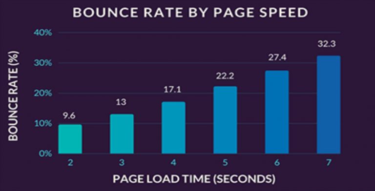
There is a clear correlation between the bounce rate and page speed. The graphic below, taken from the article How Page Load Time Affects Bounce Rate and Page Views, data shows that for each additional second of a loading time, the bounce rate is larger 4%.
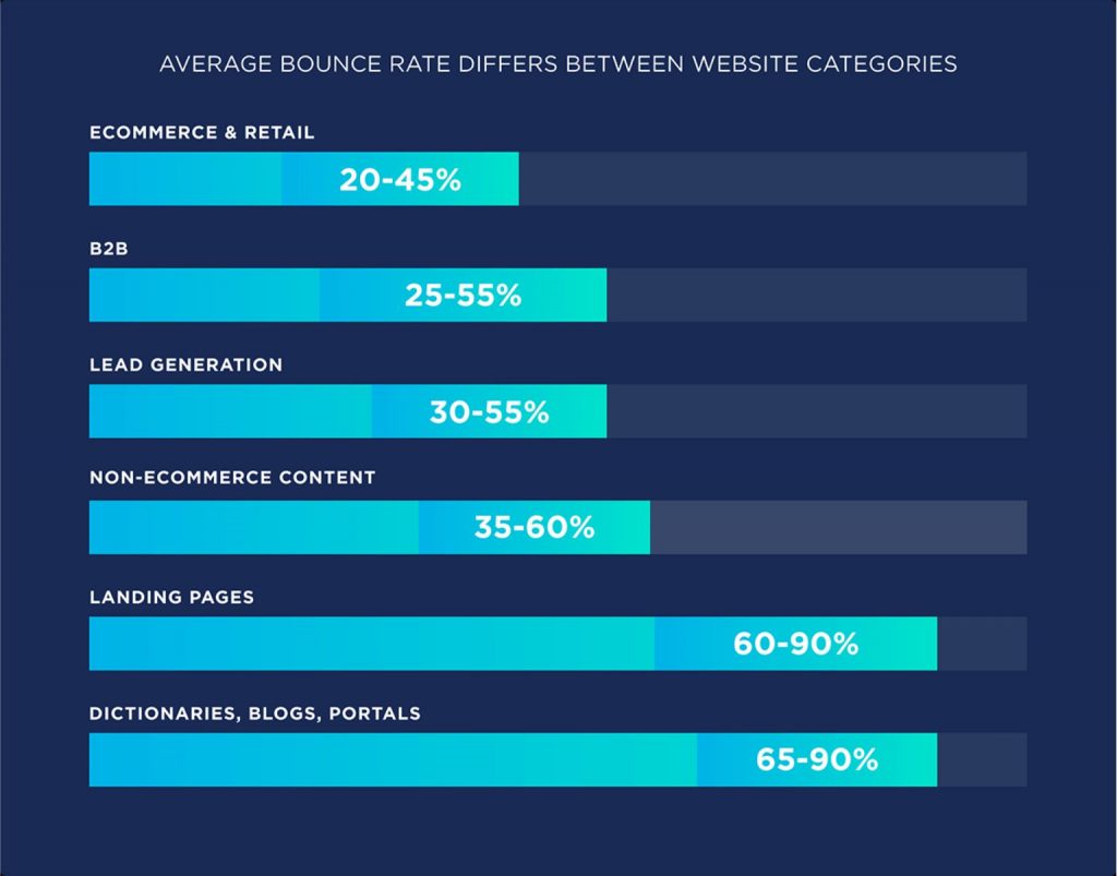
*BOUNCE RATE is a percentage of visitors who came to a website and left it without exploring pages and content. The average bounce rate is different based on the website’s category.
On the Becklinko website, we found this graph:
On the same link, you can read the full article about a correlation between bounce rate and page speed.
If your website has a higher bounce rate, you should investigate the reason.
Check the speed of each page on your website and apply recommended improvements.
Here are two free software:
GtMatrix and Google’s Page Speed Insights. Page Speed Insights is better since it gives desktop and mobile website data.
2. Make your website mobile-friendly (responsive)
On the image below, on the left are non-mobile-friendly websites. On the right are responsive ones.
In 2013. Google announced that responsiveness is a ranking factor. Responsive and mobile-friendly are the same. It means you don’t have to zoom in when viewing a website on mobiles.
Secondly, based on statistics, in 2015. only 31,16% of all traffic came from mobiles. In 2022. 59% of all internet traffic happens on mobile phones. That means it’s more important how your website looks on mobiles than on desktops.
3. Is your website secured with SSL (HTTP vs. HTTPS)
There are several reasons why having an SSL certificate is a must:
- to affirm ownership of the website,
- to keep user data secure,
- for SEO and higher ranking,
- to accept online payments,
- to improve customers’ trust.
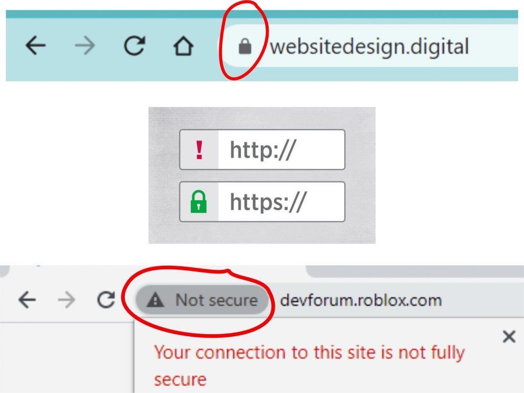
You don’t need any technical knowledge to check if your website has an SSL certificate. Type in your website address. You are good to go if there is a padlock in front of the address. If not, immediately get SSL. The easiest way is to email your hosting provider and ask them to add an SSL. Most providers don’t charge it. But if they do, it won’t be expensive.
4. Upgrade design to current trends
The world average of time spent searching the internet in 2022. is almost 2 hours (108 minutes). Your potential customers expect to see a modern, clean design based on their experience while visiting other websites. If your website doesn’t have a modern design, that would be a significant “minus” for you. You don’t want to disappoint website visitors. The first impression matters, and it can be made only once.
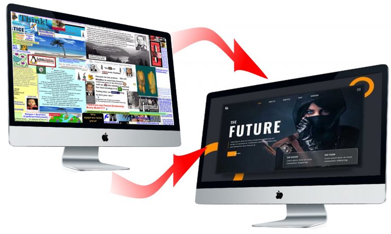
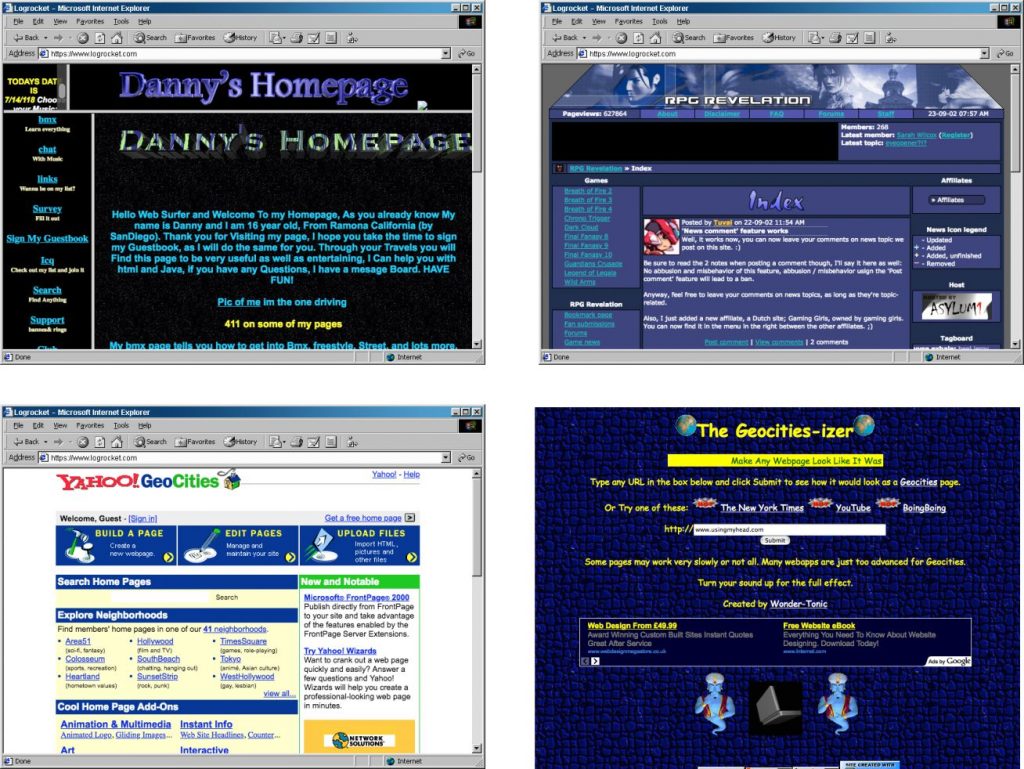
If your website looks like this:
It is time to update and improve your website’s look.
Check our article When it is time to redesign a website, it will help you decide if you should start today.
5. Make a keyword list and use it smartly
Keywords are phrases (on average, a keyword consists of 3- words) your potential customers type into Google when searching for something on the internet.
Search engines regularly crawl websites and store data to provide SERP (Search Engines Result Page) quickly. For each keyword, you’ll get different SERPs.
Among data search engines store are keywords, one of the most crucial ranking factors.
Think of all possible keywords your customers might use. Make a list – the longer, the better. Assign several keywords to each page of the site. NEVER use the same keyword twice – if you do so, your pages will compete against each other.
Choosing good keywords and using them smartly is the most challenging part of SEO. We strongly recommend using an expert for that.
7. Use professionals as advisers, not as tools
If you don’t want to learn SEO, design, and digital marketing, you should hire professionals to bring traffic to your website. Yes, you are the boss, and the website is yours. Be smart, and use the expertise you are paying for.
Tell professionals what you want to achieve and let them work. To improve a website, one has to lead, not command.
The most common mistake new website owners make is hiring experts and holding them on a short leash. People you hired know much more than you. Lead them smartly – get the maximum for your money.
8. Hire a designer and listen to their advice

Whether you like it or not, here is a sad truth: if you are not a designer, you are not competent in designing a website. You can probably say what is ugly and beautiful, but that is not enough.
If you are like 95% of new website owners, your website design sucks. The reason is you lead the designer to make a website for you. It’s time to design a website for your customers.
To improve a website, use your buyer persona profiles and hire a designer (again). This time, listen to what they say and improve the website’s overall look. Results will be instantaneous.
9. Hire an SEO expert
If on a tight budget, you can try SEO yourself. There are tons of videos and articles on the topic. Here is one excellent, short (7-minute) video to start with:
SEO Tips To Help Your Business Get Found in Search.
We recommend hiring an expert unless you have extra time and the desire to change your profession. Since SEO is an ongoing process, If you are like most people who are trying to improve a website and get more customers, you won’t have time to perform SEO correctly.
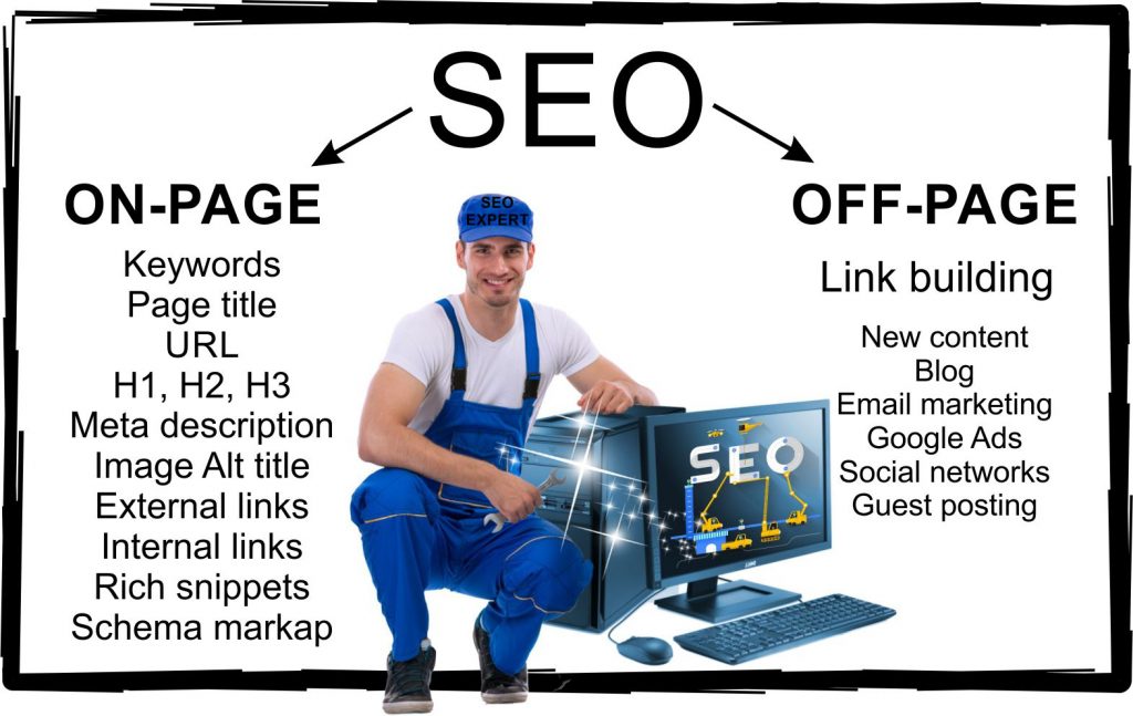
On-page SEO is relatively easy, especially if your website is on WordPress. Use the RankMath FREE SEO plugin and follow the instructions. The tricky part is finding and using keywords properly. You can hire freelancers on Upwork and Fiverr to find keywords for you for $50-$100.
Off-page SEO is a marathon, and for that, you need an SEO consultant. For a start, use our Free Website SEO Ranking Check, and we’ll tell you exactly what you should improve.
10. Use professional content writers
Content is one of the most critical factors for high ranking. Money invested in great content is one of the best ways to improve a website.
You should have professionally written content if you want a modern, professional website. Unless you are a professional content writer, you are not competent to write high-quality texts.
The best results are if you combine your expertise with a professional writing service.
The most common mistake website owners make is writing content by themselves and believing they are doing it correctly.
- Do you know how to write engaging, compelling texts?
- Can you perform SEO?
- Do you know what will be shared, liked, and linked?
- Are you sure that you can produce professional content that will rank high?
- Can you write to provoke action?
If answers to all five questions are not “absolutely yes” – hire professionals.
If you are not convinced and want to write content, please read our articles Writing for the Web and How to Write SEO Product Descriptions. Also, read other articles and watch videos to increase the chances that your content will rank high and convert visitors to customers.
11. Turn off your ego

Do not build a website for yourself. Think about your customers. Be smart and use buyer persona profiles and designer’s advice. Unless you are a marketing guru, you probably don’t know what will positively affect your customers.
Imagine your ideal customers and show them why they should buy from you, join your group, subscribe to a website, or do business with you. Be selfless.
12. Define buyers’ personas

In the article How to Create Detailed Buyer Persona you’ll find out the step-by-step process and downloadable PDF free template.
Imagine 3-5 of your perfect customers (if unsure, talk to your sales department). They are your target audience. Each buyer persona differs by:
- gender,
- age group,
- economic status,
- education level,
- geographical location
- interests
- preferable social media platform.
The main pages on your website (the Homepage, About Us, Prices, Services, etc.) should cover all buyer personas. Additional content and improvement efforts should target one or two groups.
If you are running an eCommerce business, write product descriptions targeting all groups but separately. Use different H2s and H3s for that. In our article How to Write SEO Product Descriptions you’ll find a detailed guide for powerful, high-ranking product descriptions based on buyers personas and SEO rules.
To improve your website and gain more visitors, leads, and customers, always remember your buyer personas – their problems, needs, communication, decision processes, and general behavior.
13. Replace “I” with “You”
To improve your website and increase conversion rate, go through texts on all pages to adjust them to customers’ needs. Wherever there is “I” replace it with “You”. If the sentence doesn’t sound natural, rewrite it to address others.
Start from the About us page. Wherever you describe your company, experience, products, services, and history, rewrite it to show how that benefits a visitor. If it doesn’t – remove it.
Nobody cares how special you are. But, they care how your specialty can serve them. You don’t need to be modest as long as you talk about the benefits for site visitors.
14. Talk to your customers – address their needs

Each page, post, and product description should address your customers’ needs. Even the About us page shouldn’t “talk” about you. Since your audience has a short attention span, use an elevator pitch style as much as possible.
Tell your website visitors how you will help and which problem you will solve. Predict their questions and answer them. Show that you understand their desires and your way of satisfying them.
Using knowledge about your customers, adjust the writing style and language. Obviously, you won’t use the same pitch if you have to persuade a teenage gamer or a wealthy grandma.
One of the easiest ways to improve a website is to go through all content with a person who is the most similar to your perfect customer. Contact your most loyal customers and ask them to evaluate your website honestly and strictly. Award them for the effort and apply changes they proposed.
15. Give more than expected

People are searching the internet to:
- Get information
- Learn
- Entertain themselves
- Compare products and services
- Purchase
- Become members
Whatever your website’s purpose is, always give more than your visitors expect. Add a gift in the form of:
- Free service
- Discounts
- Expert advice
- Free downloadable content
- Coupons
- Free trials
- Links to other websites
- Free consultation
Doing so will improve your website and significantly increase the chances that a visitor will stay longer, come back, purchase, contact you, subscribe, share, leave a positive review and recommend your website.
16. Clearly show how your product or service improves life and solves problems
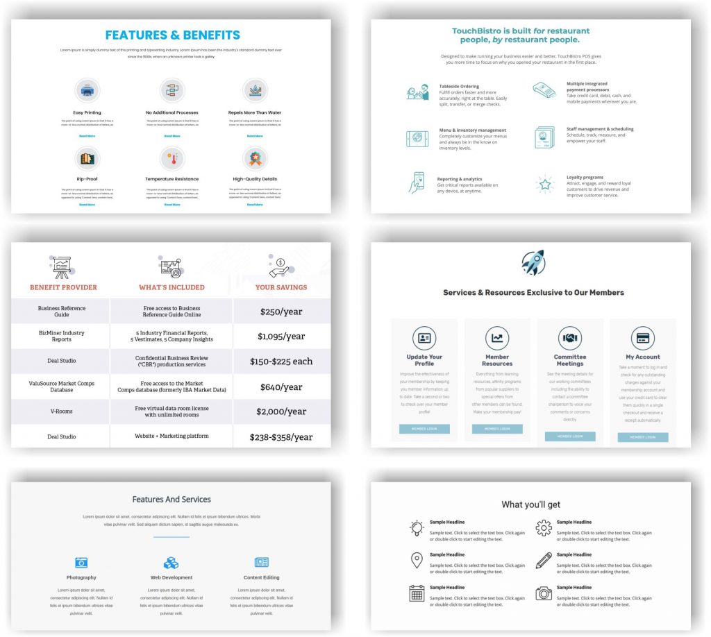
Below the Hero section of each page, put a section with benefits from your product or service. Here are some excellent examples.
Each website page has a purpose. The hero section should entice visitors to stay on the page. The following section, with benefits, will show that you can solve a problem or satisfy the need. That is what brought them to a specific page.
Don’t write essays. Use several short sentences and an icon or an image. Show how you are different and convince visitors that they are at the right place.
If you have an eCommerce website, put key product benefits in the short description. Use one of the templates in the detailed product description to further elaborate benefits.
17. Show why anybody should buy from you or work with you
Newcomers to your website are skeptical.

When you write about your business, most people are skeptical. Answer the “What’s the catch” question in advance.
Try using a combination of testimonials and before-after images.
In eCommerce, to dissuade the skeptics, show the usage of the product or some other benefits that differentiate you from competitors.
On the Homepage, use “Why to choose us” as an H2 and clearly show and tell.
18. Present your process
No matter if you sell products or provide services, show how you work.
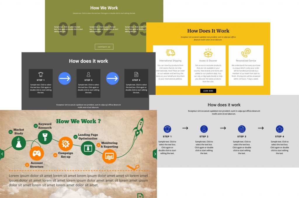
Use free templates or hire a designer to make a unique section. Don’t go into details; simplify your process and split it into 3-6 steps.
In eCommerce, add the section “How to purchase” or the user manual on the Homepage or the Shop page.
How will it improve a website?
- Visitors will appreciate the openness
- Your brand will be empowered
- Using keywords and alt image titles will boost rank in SERP
- You’ll save a lot of time explaining again and again.
19. Replace Stock photos with original images
How many times did you see these photos on different websites?
Do you feel enticed to do anything when you see one of these images?
Images can be the most powerful content on a website.
- In eCommerce, great images can increase by 80% the chance that a visitor will click the Buy button!
- Whether a visitor will stay on the website or leave after a few seconds largely depends on the image in the Hero section.
- Your website can rank high if you have original images with smartly chosen keywords in the Alt title.
- You can empower your brand with original photos.
Don’t use free or paid stock images. Make your own. Use a professional photographer or shoot photos with your mobile phone. Each image on your website should be original and provoke some emotion.
Replacing plain, boring images is one of the most challenging ways to improve a website, but it will be well and smartly spent money (and time).
20. Use professional images
Based on statistics, in eCommerce, if two products from two sellers differ only by images (same price, product description, payment and shipping options, good website design, and navigation), the product with better images will be chosen in over 90% of cases.
From which seller would you purchase – the one with images on the left or the right?


Another reason to pay a professional photographer is the power of images. Decisions are generally based on emotions and subconsciousness. Images affect both. Professional photographers know how to shoot photos that evoke strong emotions or send a powerful message. On the website Brightside.me check 15 beautiful professional photos and analyze what you feel.
Lastly, a lot of internet users search by images. If you improve your website with professional photos, Google will show them in SERP, and visitors will come to your site for more.
21. Show real people instead of shaking hands or creepy smiling models
As said before, buyers trust other buyers. Use images with real people to show how your product or service helps. Shaking hands and models with fake smiles are everywhere, and visitors don’t react to them.
Find free images or pay a photographer to shoot ones and improve the website with photos of happy, realistic people in everyday situations so your visitors can relate. That is the message you want to send – your product or service improves lives.
Another proven way to improve a website is with images before and after. The “before” one should show sadness, anger, and disappointment. The “after” photo should have intense colors, smiling faces, and satisfied customers.
22. Compress images to less than 300 KB
Photos taken with mobile phones are large, with over 2000 KB.
Always compress images before embedding them on the web page. Check with your designer if they use original or compressed images.
Load speed time is drastically reduced if images have under 300 KB.
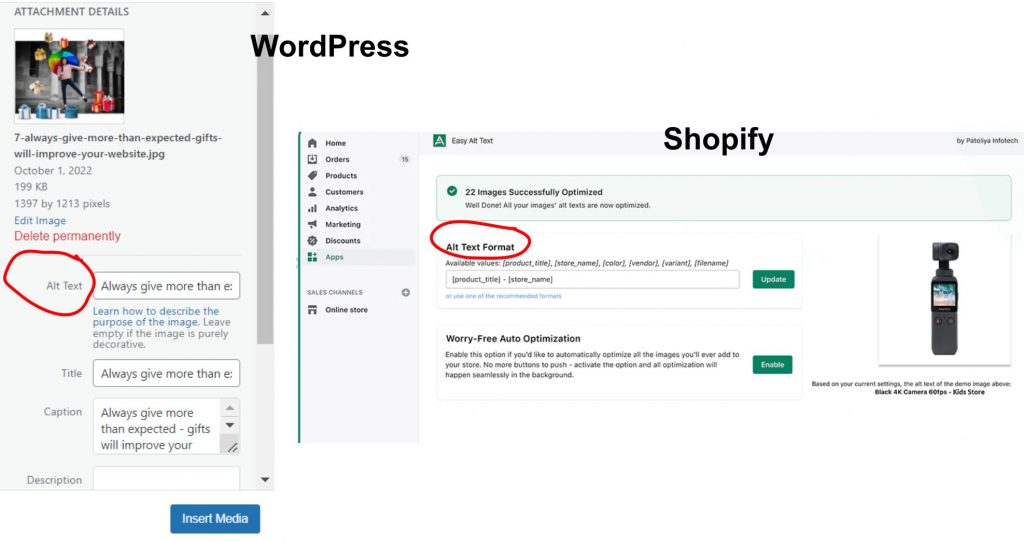
23. Add Alt title (text) to all images
Search engines can’t see images. They look into image Alt text to “understand” what the photo is about. To improve SEO, each image on your website should have Alt text with the primary keyword used on the page where the image is embedded.
Check with your designers if they add Alt Titles to images (usually they don’t). If you don’t know how to do it yourself, an SEO expert will do it to improve the website and its rank.
24. Add best practices from your niche
Don’t be afraid to publish blog posts about best practices from your niche. Use examples from big companies and influential individuals. Articles with “The best of” attract visitors and bring backlinks. You will not lose potential customers. The benefits will be manifold.
- Attracting new website visitors
- Acquiring backlinks
- Empowering your brand by showing that you follow niche leaders
Add interviews with known managers, CEOs, and influencers if you can. With powerful Headlines and images, those posts will gain significant traffic and backlinks. You will not attract “hot” leads, but you’ll improve your website’s domain authority. The higher the domain authority, the better ranking in SERP for other keywords.
25. Add traffic magnets such as quizzes, calculators, tests, SaaS
Quizzes, calculators, tests, and SaaS are four guaranteed ways to improve a website and boost traffic. You probably won’t capture hot customers, but you will get traffic, backlinks, shares, and likes.
You’ll need a programmer and sometimes even a team for all mentioned traffic magnets. The price will go from low hundreds to several thousand dollars.
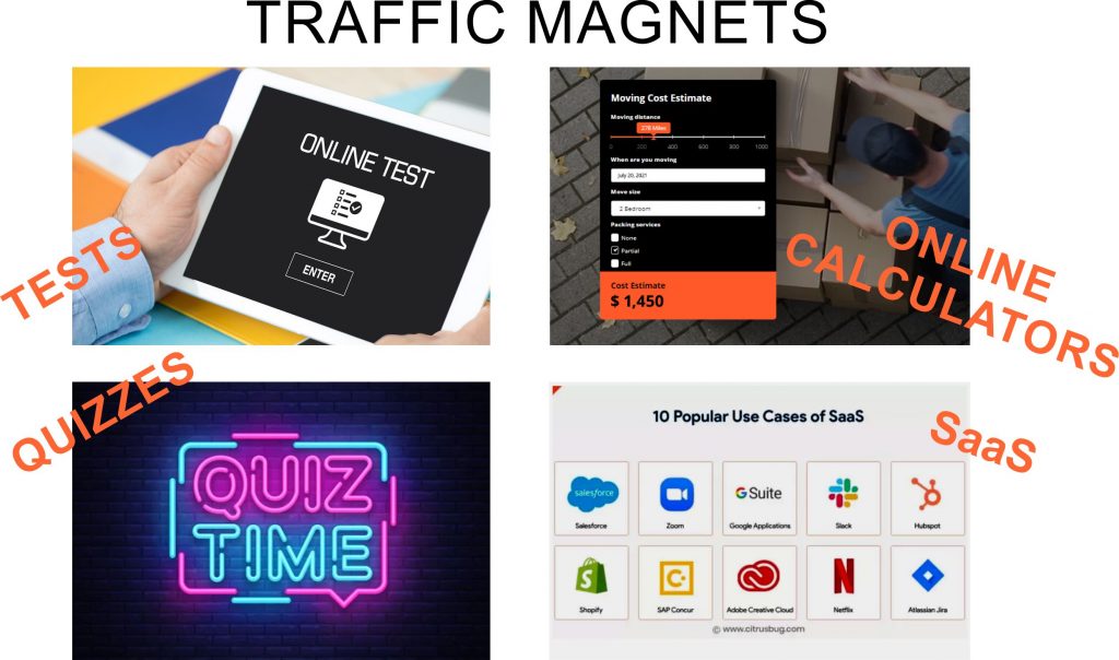
On Fiverr and Upwork, you can find programmers who will make good quizzes, tests, and calculators for under a thousand dollars. Additionally, you’ll have to invest your time if you want a high-quality tool. To be fully effective, a tool you add to a website should represent your expertise, product, and service (if you are in a transportation business, you shouldn’t add a calculator for real estate prices or a test “Discover your career path”).
- If you have an educational section on your website, you might find a DIY quiz in the article 22 Free Online Quiz Makers.
- On the website EasyTestMaker you can make your own test for free.
26. Use the first screen of every page smartly – don’t overstuff it
The first screen seen without scrolling is the Hero section. The excellent Hero section will improve a website in two ways:
- Visitors will be enticed to stay on the website, thus lowering the bounce rate (excellent for SEO and ranking)
- The conversion rate will skyrocket (people will click the magic button, whatever it is)
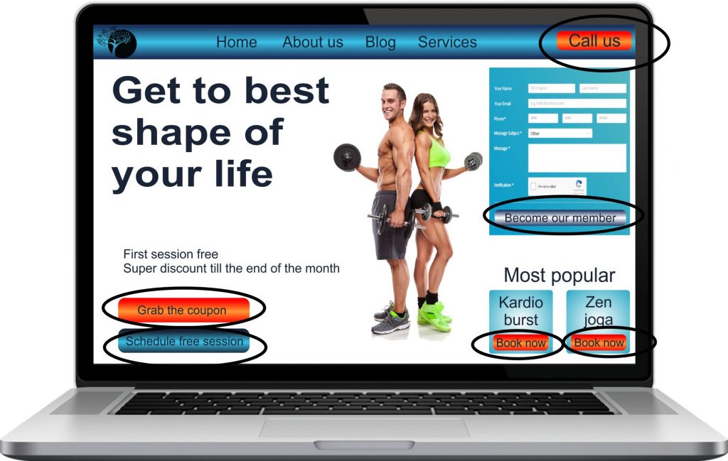
Here is an example of a poorly designed, overstuffed Hero section:
- Do you know in less than 5 seconds what this website is about? Is it a fitness center, an app, coaching website?
- Do you feel confused with six call-to-action buttons?
- Would you stay on this website or leave?
Watch this 13-minute video to find out how to lead your designer to have the best Hero section.
Here is a recipe for a highly successful Hero section:
- Use ONLY ONE call-to-action.
- With a big font, underline the main benefit or emotion. Start with the verb (Feel, Get, Experience, Indulge, etc.).
- Below, in regular fonts, clearly explain what you sell or do
- You can add the number of years of experience or some other major advantage that differentiates you from your competitors.
- You may add reviews or brands you work with.
27. Improve the Homepage
The primary purposes of the Homepage are to:
- Tell visitors where they are
- Show benefits and reasons to buy, subscribe, schedule, book, etc.
- Persuade people that you are the best choice
- Give proof for previous statements
- Answer “Why us” and “What’s the catch” questions in advance
- Entice a visitor to explore further or (best case scenario) to click the call-to-action button.
The Home page is not where you should speak about yourself or go to any details about prices, special offers, categories, news, etc. You might add Featured products and products on sale on the eCommerce website.
Statistics show that short Homepages have an almost 70% higher conversion rate than long ones.
To better understand how a modern Homepage should look, watch this 20-minute video Small Business Website Homepage Makeovers.
Here is a recipe for a great Homepage – sections you must and should have:
- Hero section
- 3-6 benefits
- Social proof (reviews and testimonials)
- 3-6 advantages that differentiate you from competitors
- Answer 2-3 most common questions
- Featured products (or services)
- THE SAME call-to-action as on the Hero section
AND NOTHING ELSE!
28. Improve the About us (me) page
Do you know that the second most visited page on the internet is the About us page (number one is the Homepage)? So, make it count – it can make a difference between failure and success. Also, if you use a different set of keywords than on the Homepage, you’ll rank for more keywords related to your niche.
IMPORTANT: the About us (me) page shouldn’t be about you at all. The About us page must persuade visitors that you are the best for them!
Check this 9-minute video, “Website About Page Tips: 7 Secrets to Get it Right“.
What should you put on the About us page?
- Great headline in large fonts instead of boring “About us”. In one short sentence, show why you do what you do and what you stand for. If you started your business to satisfy your need or solve a problem, put that in the headline. Visitors will feel you can relate to their situation.
- “Why you” is the next section. Make it interesting and short (no more than 1-3 paragraphs). Tell the story. Keep in mind the goal – without bragging to give information relevant to visitors. Keep in mind what they would want to hear. What will be a strong motivation for them?
- “How did you become an expert in the field” – is the next section. Give information relevant to visitors in no more than three sentences (and a great image). What does matter to your customers? Why do they trust you?
- “How you help” or “How will you make the visitor’s life better” – next section with more text. Add before and after images, embed a video showing your work and process, and use real-life stories and examples. If you have a video testimony, this is the best place to embed it.
- One photo of you or your team – help visitors connect – it’s easier to communicate with a person than with a company. Choose a natural image, preferably without posing for it. Don’t use a photo with a “cheese” smile and hands crossed over the chest (that is a guarded pose).
You may include:
- Certifications, awards, press mentions, and powerful statistical data – support your claims and further build trust and respect.
- Mission, vision, goals, and history should be at the bottom to show who you are. Make it short, honest, and personal.
- Credentials and recommendations from influencers, respectable individuals, celebrities, or other high-authority figures.
What should you NEVER put on the About us page?
Never put your team biographies on the About us page. Two main reasons there are for that:
- It’s a distraction – there is a high probability that visitors will leave the website, go to Instagram, Facebook, and LinkedIn, and forget to come back.
- The About us page is not a review of your business or a place to feed someone’s ego. The goal is to persuade visitors that you are the best choice. If you think your team’s bios and photos will bring more to the table, make a separate page.
29. Add content regularly
One of the most time-consuming but the least risky ways of improving a website is a blog. You should hire a professional content writer if you don’t have time to publish 4-8 articles with 2000 words or more. A high-quality blog will boost your website’s traffic, increase domain authority and bring backlinks.
You will not gain hot leads, but with high domain authority and a strong brand, you will position your website at the top in search results for all keywords you target.
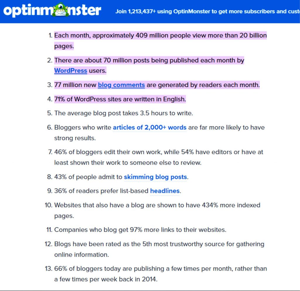
Here are some useful 2022. statistics from the article Ultimate List of Blogging Statistics and Facts:
IMPORTANT: avoid the most common mistake website owners make: blogging without a strategy and keyword research.
Here is a recipe for a good, successful blog:
- Start with keyword research – plan which keywords you will target with each post in the next 6-12 months. Do not use the same keyword twice.
- Check trends and interests.
- Write H1, 2-4 H2-s, and 3-6 H3-s. Use planned keywords in each headline.
- Check 3-5 competitors who target exact keywords and make a longer, unique, and more helpful post. Use more media, facts, and expert opinions.
- Start writing as if you were answering questions asked in headlines. Elaborate on each headline. Do not deviate from the topic.
- NEVER copy/paste – neither your content nor from other websites! Each post must be original. If you use data from other websites, rearrange them and draw your conclusion.
- Give your expert opinion.
- Add external and internal links.
- Give proof.
- Make it easy for visitors to share and like.
- Check grammar and spelling.
- Edit and re-edit.
- Repeat the whole process once or twice a week.
30. Monitor what people want to know and write about it
There are three reasons why you should monitor trends and your customers’ interests:
- Traffic and ranking boost
- Higher conversion rate
- Better offer and sales (adjust your products or services)
To regularly add content, predict customers’ needs and establish your brand, once or twice a month, spend an hour, and do thorough research. Use free tools such as AnswerThePublic, Google Trends, and BuzzSumo.
Also, use Instagram, Facebook, and Quora to understand better and predict customers’ and competitors’ behavior.
No matter how successful you are, Google ranking is an ongoing battle, and you must never relax. When you stop improving your website, the ranking will suffer.
31. Share your expertise and build a brand and trust
As a service business, you’ll attract visitors, establish your brand, build confidence, and increase conversions by sharing your knowledge, experience, and expertise.

Write manuals, make instructional videos, publish DIY guides and give free prognoses and predictions. Selflessly share your expertise on the website – this is a guaranteed and proven way to attract visitors and convert them to loyal customers.
If you don’t have time, use your mobile phone and record your thoughts while walking, driving, or waiting for something. Hire a writer to transfer it into an article and publish it on the website.
32. Add linkable, shareable, and downloadable content
Linkable content is a backlink magnet. It doesn’t have too much traffic, but it significantly improves domain authority, thus positively impacting Google rank.
Linkable content is:
- Articles rich with data
- Lists and guides
- Infographics
- Podcasts
- Educational articles and videos
- How to guides and manuals
- Tutorials
- Demonstrations
- Prognosis
- Demos
- Press releases
- Interviews
Regularly published, all mentioned types of content are certain ways to improve a website and build backlinks.
Shareable content brings traffic from social media. The more traffic website has, the better the overall ranking for all pages and posts.
Shareable content is:
- Stories
- Media (photos and videos)
- Interviews
- Articles with quotes, wisdom, and sayings
- Riddles, quizzes, crosswords, puzzles, and tests
- Guides with headlines “in less than several minutes” or “in only several steps”
- Funny or tragic situations and news
- Celebrity and influencers interviews and sayings
- Research results
- Discoveries
- Speculations and debates
Downloadable content strengthens the brand and prolongs time spent on the website. If you condition the download with a subscription, it can be a lead generator. We recommend giving it for free, without any conditions.
Downloadable content is:
- eBooks
- How to guides
- Tutorials
- Manuals
- DIY instructions
- Exercises
- Lists
- Scientific findings
- Statistical data
- Templates
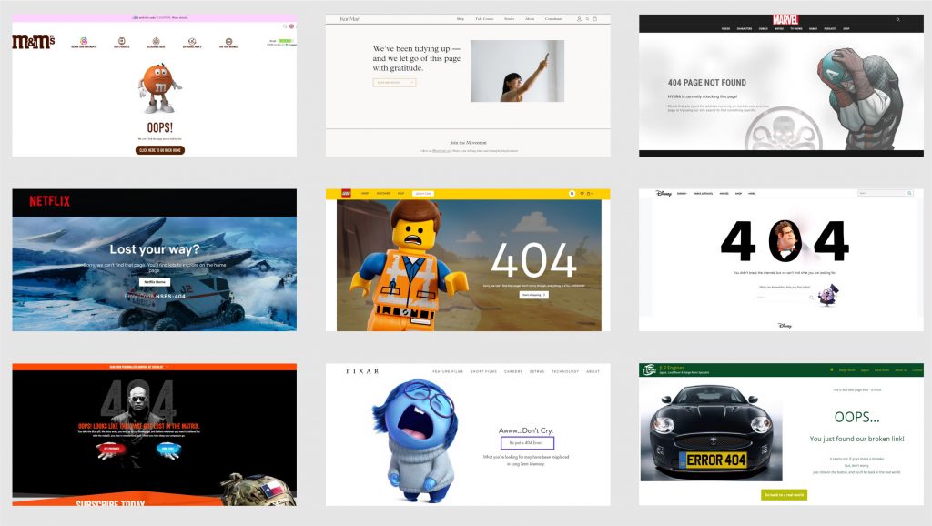
33. Make a unique 404 page
Page 404 is where visitors lend if they click on a broken link (the link that points nowhere). A unique 404 page will not bring traffic, but it will decrease the bounce rate and increase the chance that a visitor will not leave the website.
Hire a designer to make a unique 404 page with a HUGE call-to-action pointing back to the Homepage, a webshop (on eCommerce websites), or anywhere you want a visitor to land.
Check some great 404 pages and make one in line with your brand and offer.
34. Add a FAQ page
Why should you have a FAQ page on your website? Here are the reasons:
- Good for SEO – opportunity to use many keywords;
- If your SEO expert optimizes it properly (uses appropriate schema markup), Google will rank it high when people search for answers;
- Time-saver – by answering questions in advance, you’ll avoid repeating the same pitch time and time again;
- Build trust – dissuade skeptical questions and keep visitors on the website;
- Strengthen internal link structure – point to other, less visited pages, thus improving their ranking (good for on-page SEO).
35. Add testimonial page
Buyers trust other buyers. The power of reviews and testimonials can convince even the most suspicious visitor that you are a worthy seller. Adding a separate testimonial page will significantly improve the website and strengthen the trust. And trust is the essence of all relationships.
Embed Google reviews on the testimonial page, add a testimonials section and other social proof. This is where you should brag about yourself but through others’ mouths. Let others say how excellent you are.
Do not overstuff the Homepage and the About us page with testimonials. Pick several (3-5) for those two pages. Use the link to point to the Testimonial page for visitors who need more persuasion.
Here you can find templates for the page: 160 Testimonial Templates.
36. Make a separate page to present your team
There are three reasons to make a Meet the Team page:
- As we said in the “Improve the About us page,” DO NOT present your team there – it’s a distraction. Having an individual team page might strengthen your brand and appease sensible egos.
- Smartly written, this page can be used to rank for keywords people type in Google when searching for experts.
- Also, if your team members write posts, use internal links to improve on-page SEO.

To make an excellent Team page:
- Use templates or a unique design to create a modern, appealing look.
- Avoid unnatural photos – find images where your team members look natural and happy (everyday situations).
- Above all, do not use pictures with hands crossed over chests. Subconsciously that is a guarded stance that we take during the confrontation. That pose evokes an aggressive and repulsive attitude. You don’t want your visitors to feel that.
37. Make an individual Thank you page
An individual Thank you page increases time spent on the website and chances of further conversions. Visitors will land on that page when they fulfill your first goal (subscribe, download, apply). It is polite to thank them and then nudge them towards your secondary goal.
Thank you page is a good place to give them more information, keep them interested, and deepen their loyalty.
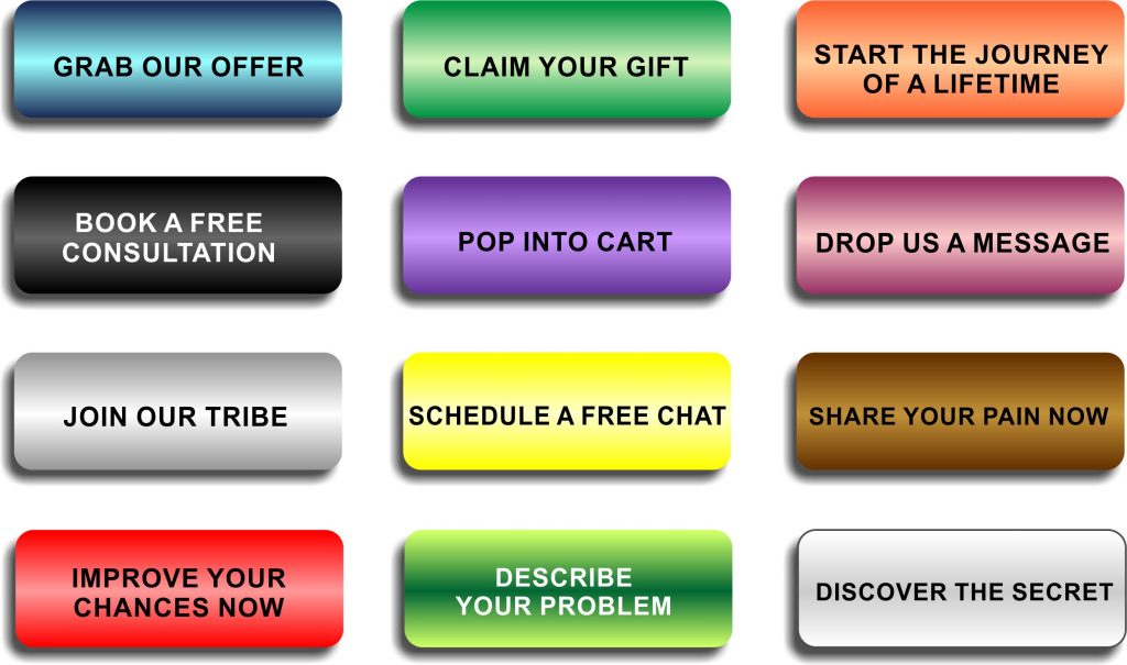
38. Replace cliches on Call-to-action buttons
You want people to click your CAT – that is the primary goal of your website, is it not? Then, instead of boring and useless “Contac us”, “Call now”, “Learn more” that won’t provoke anybody to click, be creative and persuasive. Add motivation and urgency.
Here are some ideas:
39. Eliminate distractions
Website distractions are all design and functionality elements that lower the chance that a visitor will click the CAT button.
Remove popups on regular pages – especially on the Homepage – people are not ready to join, buy, subscribe, get free, schedule, etc. You may use popups when visitors leave the website to decrease the bounce rate and generate leads.
- Reducing the number of colors on the website,
- Using only one CAT button,
- Eliminating or simplifying the sidebar,
- Removing sliders,
- Reducing the number of moving elements on the page
are certain ways to improve a website, keep visitors engaged, increase conversions and reduce bounce rate.
40. Reduce the number of clicks from the Homepage (website’s depth)
The website’s depth is extremely important for SEO and user experience (UX). No matter how many pages, products, and posts your website has, non should be more than three clicks distant from the Homepage. Hire an SEO expert and restructure the website, post, and product categories.
If you don’t follow this rule, there will be two consequences:
- Visitors will rarely go to pages and products which are more than three clicks away (they are lazy)
- Search engines might never reach and index those pages, thus never considering them for ranking.
41. Improve URLs
URL stands for Uniform Resource Locator. Each page, post, media, video, product, etc., has a unique URL (address). The content of the website’s URLs significantly impacts ranking in SERP.
There are two reasons why you should have SEO-friendly URLs on your website:
- To help search engines understand and categorize the content under a specific web content
- To improve user experience
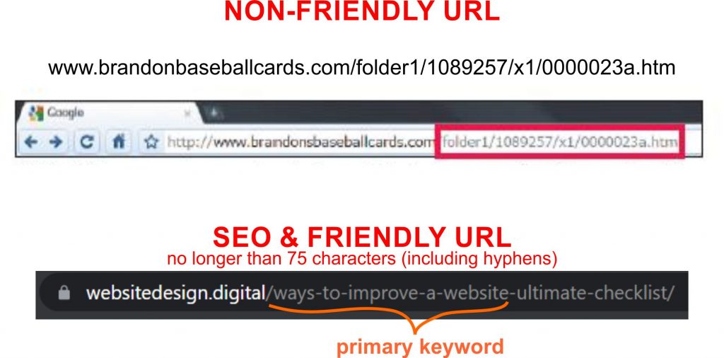
You should follow five rules to improve your website and ranking:
- URLs should be shorter than 75 characters (including hyphens)
- Use the exact primary keyword for a particular page, product, or post
- Do not use special characters
- Remove unnecessary words
- Try to make URL as similar to the page title as possible
42. Improve UX
UX represents user experience, which is how visitors feel while navigating a site. Mostly it’s related to design.
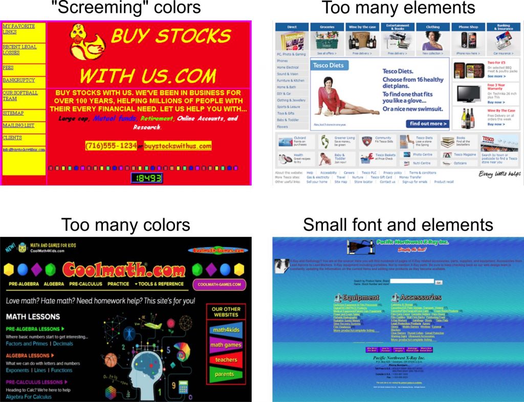
Here are examples of four bad UX websites:
Follow these rules to achieve great UX:
- Adjust your website for all devices- make it responsive
- Stick to 3-4 colors (including texts, links, hoover, buttons, etc.)
- Use narrow margins – you don’t want visitors to have to move their heads while reading (like watching a tennis match)
- Font should be 17 or 18 px
- Use a lot of white space (1/3 of each screen should be empty)
- Hyperlinks and buttons should be distinctive
- On each screen, ONLY ONE element is the most important – make it large or in a different color (not both)
- Use hierarchy to help users understand the importance of elements on the screen – it can’t be that everything is important (maybe to you it is, but users will not like it)
- Follow the principle “the less is more” – don’t put everything on one screen. Let visitors decide what is essential. Curiosity is good – provoke visitors to search and keep them on your website.
- Use clear and truthful headings – don’t tweak headings for SEO. Yes, include keywords naturally; the text below must be exactly what the title announced.
43. Improve UI
UI refers to User Interface. That is how users interact with computers and mobiles – where they click, what happens when they do, and how they interact with contact forms, menus, footers, etc.
Bad UI affects bounce rate, thus diminishing chances of high ranking in search results.
Here are some effective ways to improve a website by enhancing UI:
- Reduce the number of call-to-action buttons to only one or two on the screen
- Make buttons and hyperlinks distinctive
- Reduce the number of links on the Main menu to 6
- Don’t use the hamburger menu on desktop
- Add a clickable sticky contact icon (WhatsApp, Viber, Email – all or some of them)
- Reduce the number of fields in contact forms
- Add icons for shearing and liking
- If you run an eCommerce website, make a Mega menu
- Make elements large enough on mobile
- Don’t overstuff screens; let visitors scroll
- Direct visitors on what to do next.
44. Add external and internal links
Add external and internal links to each page, product, and post to improve the website’s SEO significantly.
Why should you add EXTERNAL links to improve a website?
External links point to other websites. When clicked, visitors leave the website. We recommend making them open in a new tab – the chance of returning to your site will increase.
There are several reasons to add external links to each website page.
Firstly, you should provide proof through a testimonial, reviews, and relevant data sources whenever you state something.
Secondly, you should use a link to point to your source if you use quotations, images, videos, or news from other websites.
When naming links, don’t use cliches such as “Read more” or “Click here.“
Here are some guidelines for good usage of external links:
- For SEO, it’s best to use the full title of the page you are linking to.
- It is fair to point to a website that “helped” you.
- You don’t need legal problems if you use other websites’ properties without authorization.
What are the benefits of INTERNAL links, and why use them?
Internal links point to pages, posts, and products on the same website. Visitors do not leave the website when clicking them. Adding internal links will improve SEO and UX.
Here are reasons to have 2-5 internal links on each page and post, and at least one on each product on eCommerce websites:
- Google and other search engines don’t crawl all pages every time. Pages that are deep on the website might never be crawled if links from other pages don’t point to them. By smartly using internal links, you help and point search engines toward all relevant pages.
- Internal links keep the visitor on your website longer. Well-named and smartly positioned internal links improve user experience.
- The chance that a visitor will do what you want them to do are higher if you position distinctive, enticingly named links.
45. Big cleaning at the end of the year
Once a year, perform a website cleaning to improve SEO and ranking. Below, you’ll find six actions that will positively impact the overall rank score.

- Update dates on posts and pages to the current ones.
- Analyze traffic and delete or improve pages without or with few visits.
- Pay special attention to the pages with high bounce rates – those are harmful to SEO score. Either remove them or rewrite the content and headlines.
- Check if you have broken links. Use the free tool Ahref free broken link checker. Remove links or change the page or media they are pointing to.
- Check backlinks. If you find suspicious and spammy links from other websites pointing to yours, disavow them. Find out how to do this in the article 4 Steps To Removing Spammy Backlinks from Your Website.
- Check all plugins and update them.
If you are unsure how to perform mentioned tasks, hire a programmer or rehire a person who built your website. Ask them to perform website maintenance – they should know what to do.
46. (Re)Categorize content (and products in eCommerce)
Well-organized content is one of the most critical factors for a great SEO score, Google rank, and user experience. If you are not an SEO expert, you should hire one and work together. You know your customers the best, and this part can’t be performed without you. On the other hand, an expert has a lot of experience and can suggest highly effective ways to improve your website’s structure.
If your website has 50-100 pages, posts, or products, categorization will not be difficult. But if you have thousands of pages, the task will require days or even weeks of deep thinking and brainstorming. There is no recipe or checklist to categorize content. Use your business history, knowledge about customers, and predictions of their future behavior.
You should read these articles to tackle the problem easier:
Also, check what people recommend on Quora – How do you categorize website content?
All mentioned applies to eCommerce websites. If you have thousands of products, we recommend performing initial categorization and let the webshop “work” for a year. Then, roll up your sleeves and sort out the categories based on online sales and future goals.
If you need help improving your website’s categories, email me and my team to schedule a 30 minutes consultation, and together, we’ll make an initial action plan.
47. Connect the website with GA, GSC, GBP, business and review listings
To improve SEO, bring traffic, and collect reviews and testimonials, connect the website and make a profile on/with:
- Google Analytics (GA)
- Google Search Console (GSC)
- Google Business Profile (GBP) – ex. Google My Business
- Yelp
- Yell
- NextDoor
- Trust Pilot
- local business free and paid listings
- social media (Facebook, Instagram, Twitter, TicToc, etc.)
GA and GSC are free tools to monitor traffic and functionality.
The following six are free business listing platforms. To fully exploit benefits, first, learn more about each platform. There are great YouTube videos and articles on how to make a great profile, rank high, and use tools.
48. Reach out to popular websites for backlinks
One of the most crucial factors for high ranking is the number and quality of backlinks. Backlinks are links from other websites pointing to pages on your site.
Google’s algorithm for ranking is a secret, but several studies show that there are ten factors with the highest impact.
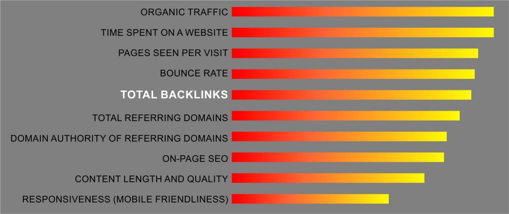
Link building is a time-consuming, long-term strategy that significantly impacts the website’s rank. The more backlinks you acquire, the higher the ranking will be. Your website will get backlinks with powerful, unique, and long content.
If you want to speed up the process, you can reach websites with high Domain Authority and ask them to link to your site.
Before sending emails with a request for a link, you should check and improve the content you’ll show. Content must be original, long, enriched with media, and with bright, inviting headlines.
What can be improved on a website
There are several strategies to get backlinks:
- Spy on your competitors, and make better content
- Publish ultimate guides
- Backlinks through infographics
- Guest posting
- Build internal links
- Promote your content on social media
- Write powerful testimonials
- Contact journalists and influential bloggers
- Find outdated content and make better, richer posts
- Relationship Building
- Appear as a guest on podcasts
No matter which method you choose to get backlinks, you must first apply as many tactics and ways to improve a website as possible. “A must” improvements are:
- On-page SEO
- Responsiveness
- Modern design
- Posts with 2000 words (at least) and lots of media (images, videos, infographics)
- External links to sources
- Reviews and social proof
- Website’s speed
- Content categorization
- Powerful About us page
- Flawless grammar and spelling
When you are sure your content is worth linking and the website is almost perfect, reach out to other website owners, journalists, and bloggers and ask for a link.
49. Make landing pages with a clear value proposition
A landing page is purposeful, one-page content built for visitors who come through Google Ads, social media, and other marketing campaigns. The goal of every landing page is to entice visitors to take action – give an email address, subscribe, join, purchase, schedule, etc.
The landing page must have a clear value proposition to achieve a goal, usually something free or with a significant discount.
To build an effective landing page, you should follow these guidelines:
- Choose 2-5 keywords you’ll target
- Make strong emotions-trigger
- Shortly elaborate benefits
- Use only ONE distinct call-to-action with a clear message
- Use images that will appeal to visitors and provoke strong emotions
- Add testimonials, social proof, and reviews to confirm the value
- Use links only if you need them
- Remove all destractions (sidebar, popups, multiple buttons and links, blinking objects, etc.)
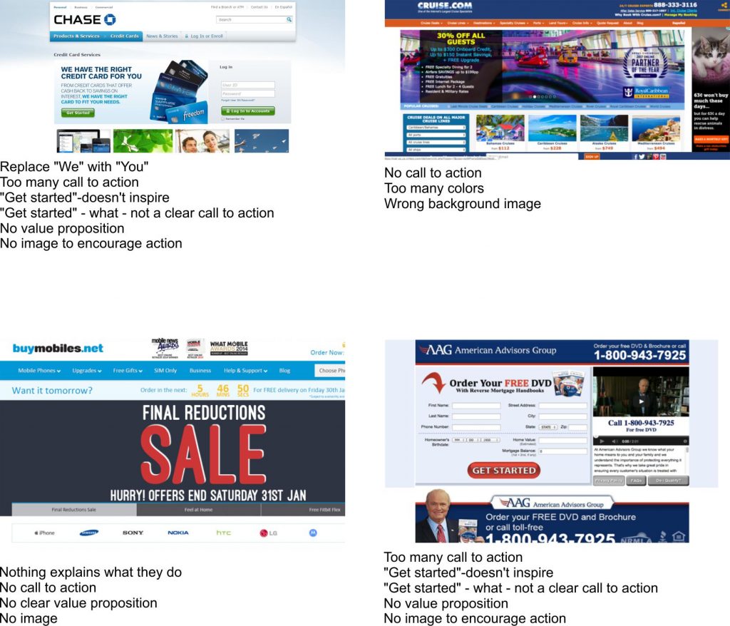
Check these four poorly built landing pages:
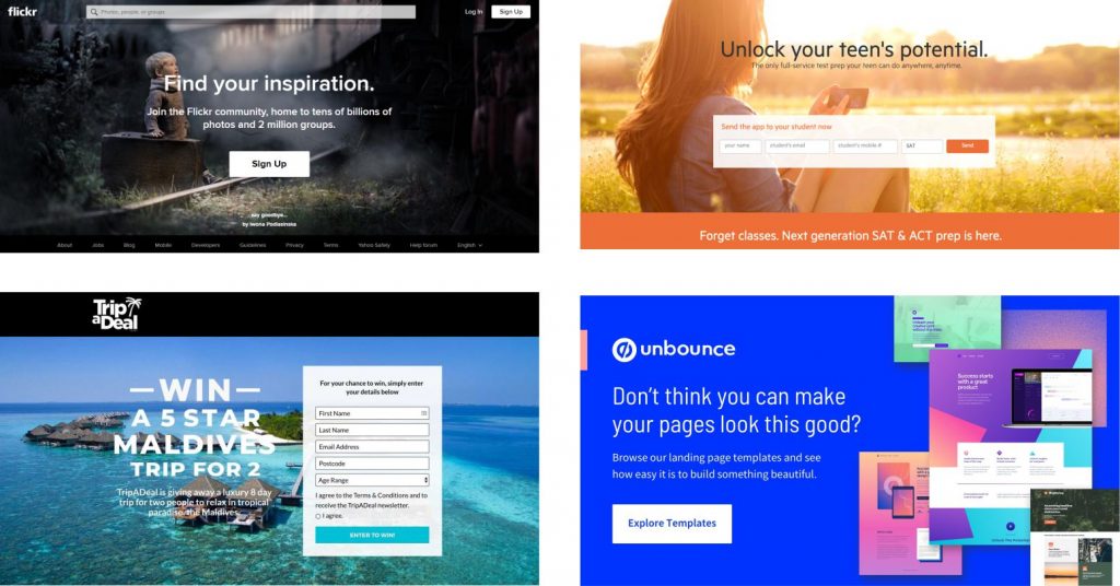
And here are four highly-effective, beautifully designed landing pages:
50. Add voice search, 3D media, virtual tours, animations
Based on the type of business you run and the buyer persona you want to address, consider adding some modern website improvements.
- Voice search is already considered a ranking factor.
- Virtual tours are expected by visitors of real estate agents and agencies, eCommerce, tourist agencies, wholesales, service businesses, etc. They significantly improve user experience and increase conversions.
- 3D media are becoming “a must” on eCommerce websites, the gaming industry, and high-tech sites.
- Animations might increase conversions, keep visitors on the website and strengthen the brand.
Smartly used, all mentioned ways to improve a website will be money well spent. If not this year, consider using them the next year.

